Iset Sans Typeface

In Europe and the United States, typefaces for urban wayfinding have a long history, and over time well-established technical approaches to such type systems have emerged. Different languages also come with their own typographic challenges: German often features very long compound words, Czech makes heavy use of diacritics, and in some countries wayfinding copy must be bilingual. Taking these factors, as well as the specifics of type in the urban environment, into account, we began developing a typeface for Ekaterinburg.

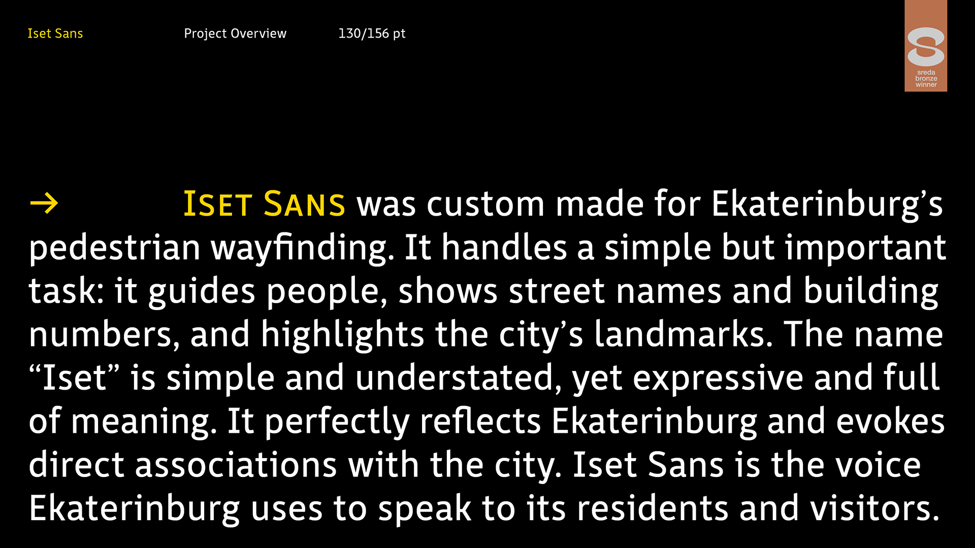
Iset Sans was developed specifically for pedestrian wayfinding and urban signage in Ekaterinburg. It serves an important purpose: guiding pedestrians along routes, displaying street names and house numbers, and highlighting the city’s landmarks. The name “Iset” is simple and restrained yet evocative and expressive; it directly reflects the spirit of Ekaterinburg and creates immediate associations with the city. Iset Sans is the voice Ekaterinburg uses to address residents and visitors.

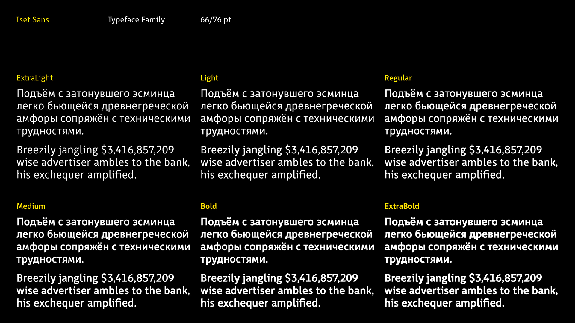
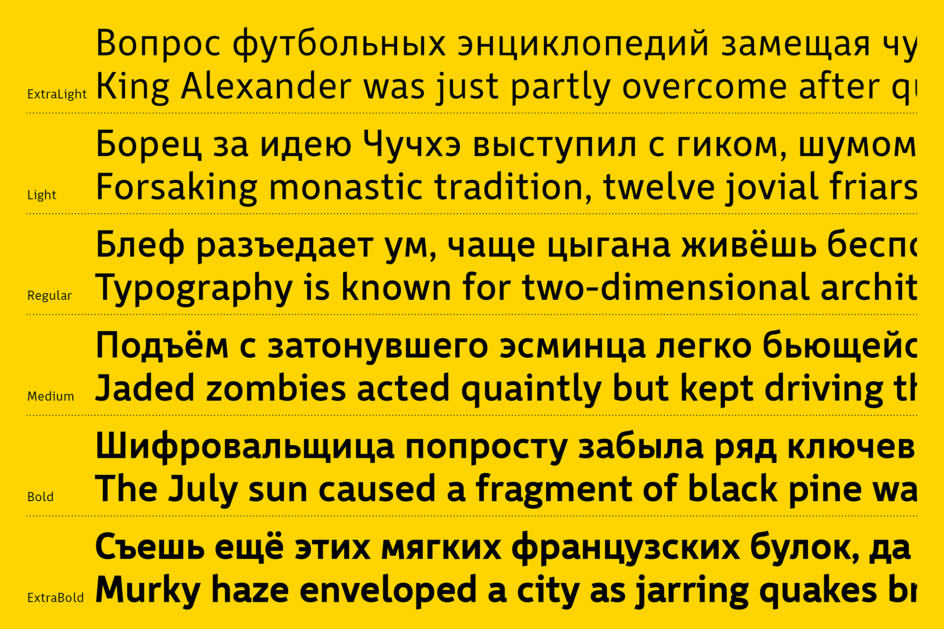
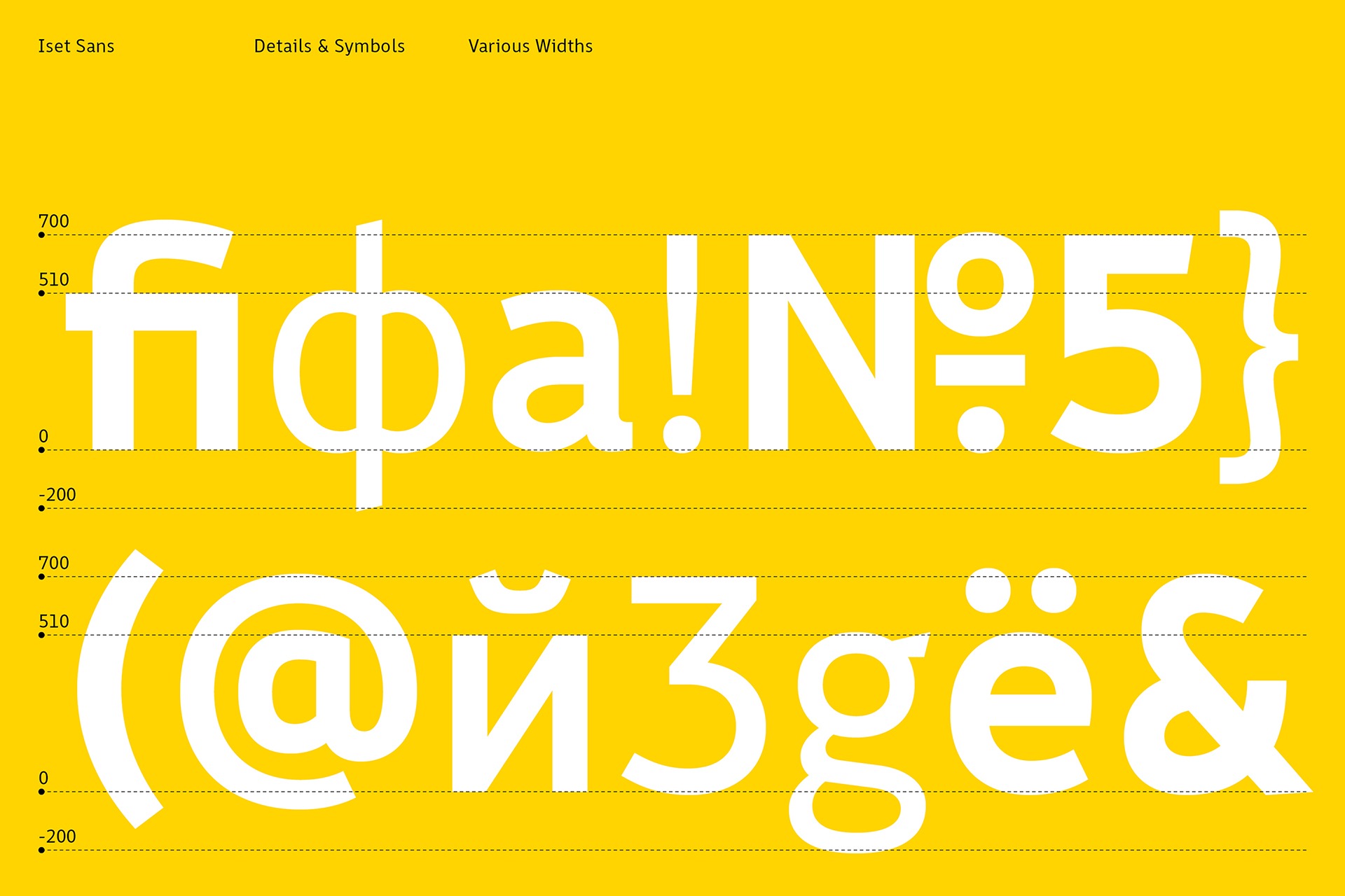
This open, dynamic grotesque features clear, slightly condensed character proportions and distinctive structural details in both uppercase and lowercase glyphs, ensuring clear legibility at a distance. The family includes six weights: ExtraLight, Light, Regular, Medium, Bold, and ExtraBold, plus Regular Italic. An optimized x-height, combined with balanced ascenders and descenders, makes it possible to set text compactly in vertical compositions. At the same time, a Uniwidth system preserves horizontal consistency, maintaining identical line lengths across all weights.

In Ekaterinburg’s urban wayfinding, dark backgrounds are widely used, including steles, signs, and information panels. For this reason, Iset Sans is designed with slightly heavier strokes than typical text typefaces; this optical compensation helps counteract light spill and keeps the signage easy to read on dark surfaces. Each weight’s character set includes proportional, tabular, and oldstyle figures, small caps, and case-sensitive forms. The family is complemented by functional ligatures, a range of spacing characters for typesetting, and an extensive set of directional arrows.

Iset Sans won bronze in the Custom Typeface category at the Sreda 2024 New Design Festival
Types of Work
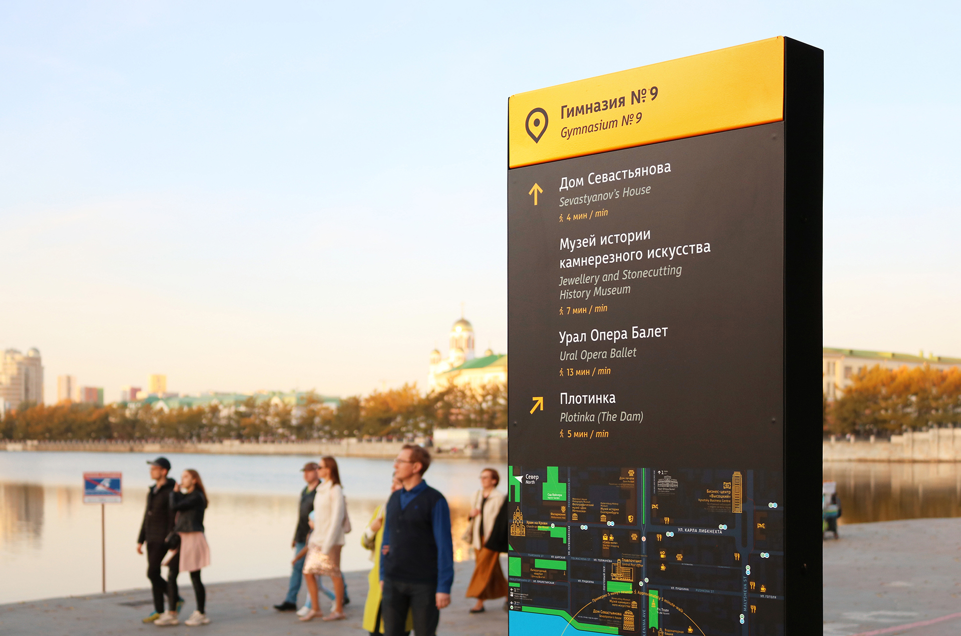
Urban navigation signage design on the city pond embankment in Yekaterinburg
Concept presentation and typography overview of the Iset Sans custom typeface, designed for Ekaterinburg's pedestrian wayfinding system
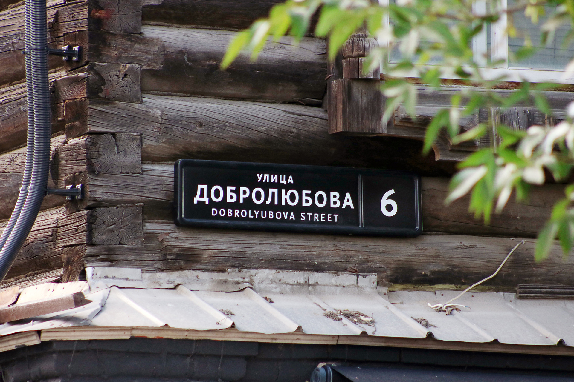
An example of the designed street name sign
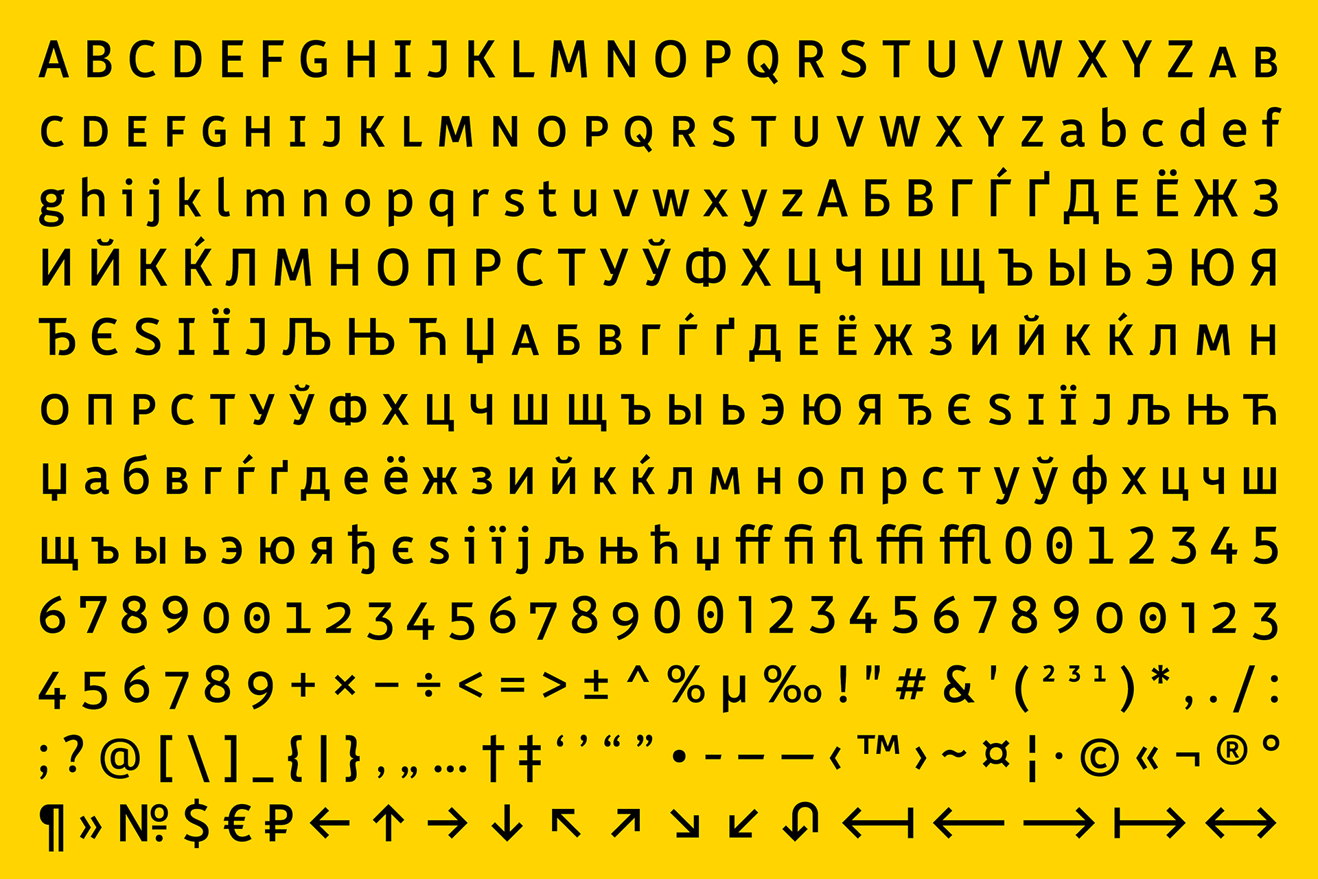
Full character set presentation of the Iset Sans typeface, showcasing Latin and Cyrillic alphabets, numerals, ligatures, punctuation, and navigation arrows
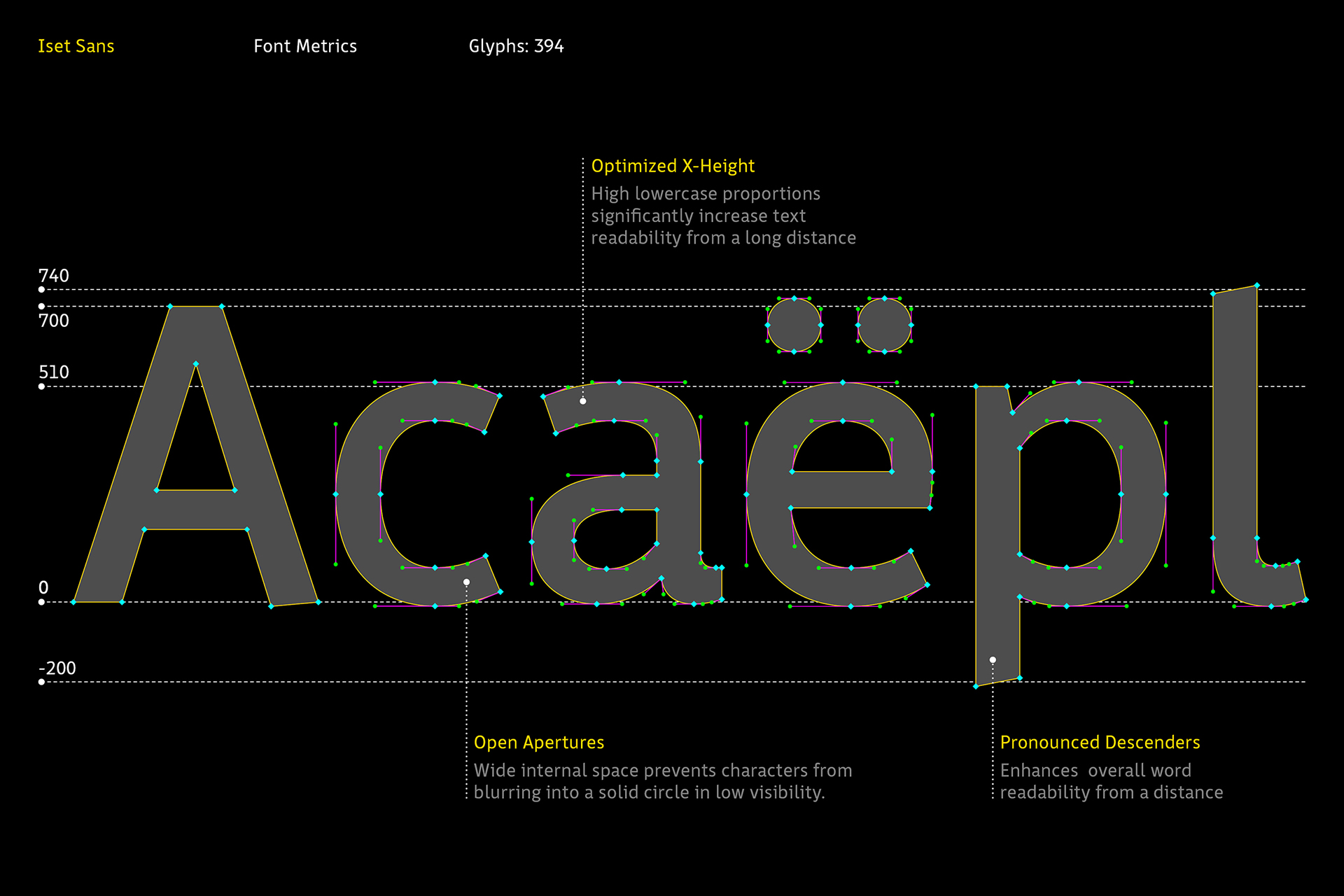
Font metrics and letter anatomy scheme of the Iset Sans typeface, demonstrating x-height, open apertures, and pronounced descenders
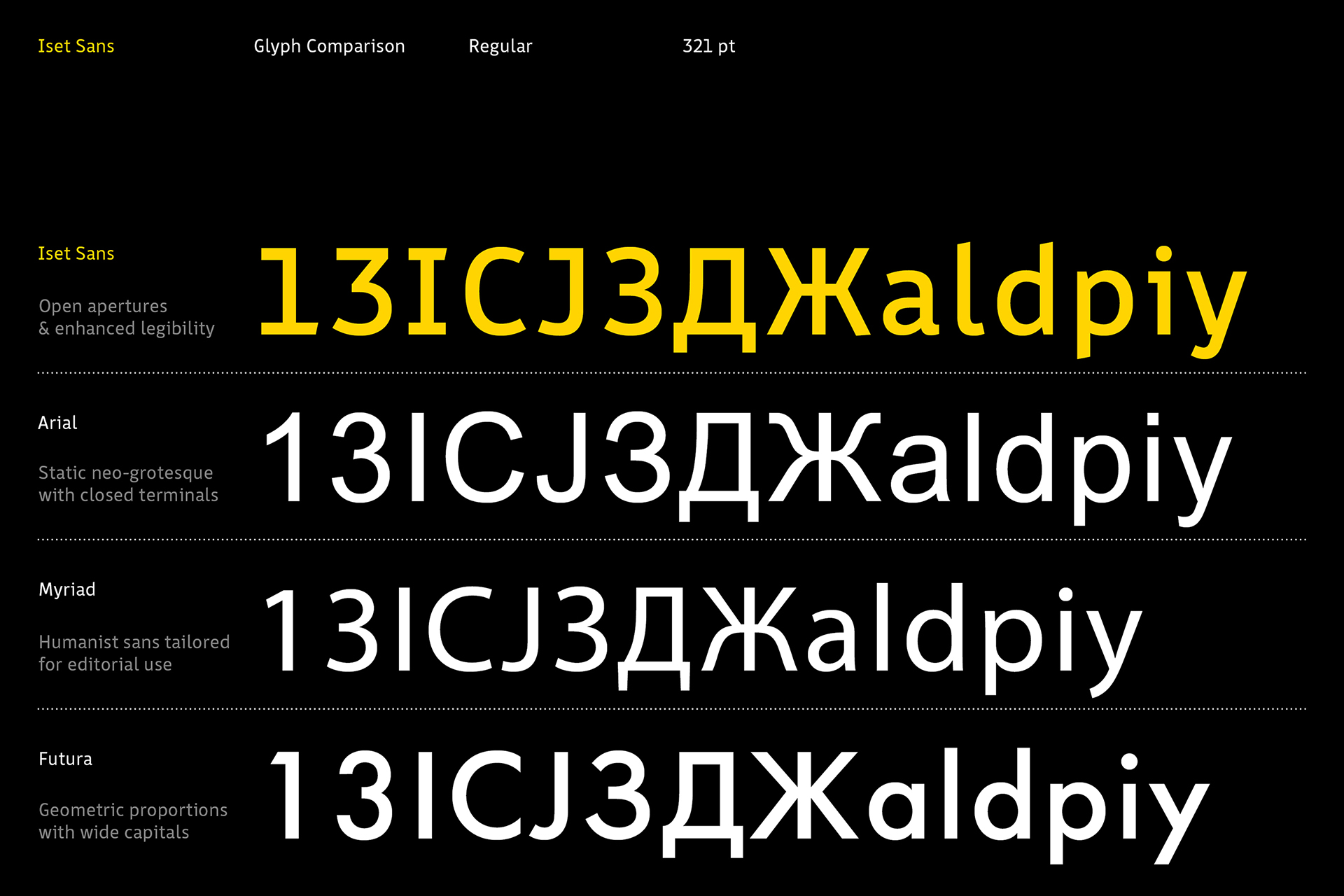
Glyph comparison chart showcasing the Iset Sans typeface contrasted with Arial, Myriad, and Futura fonts
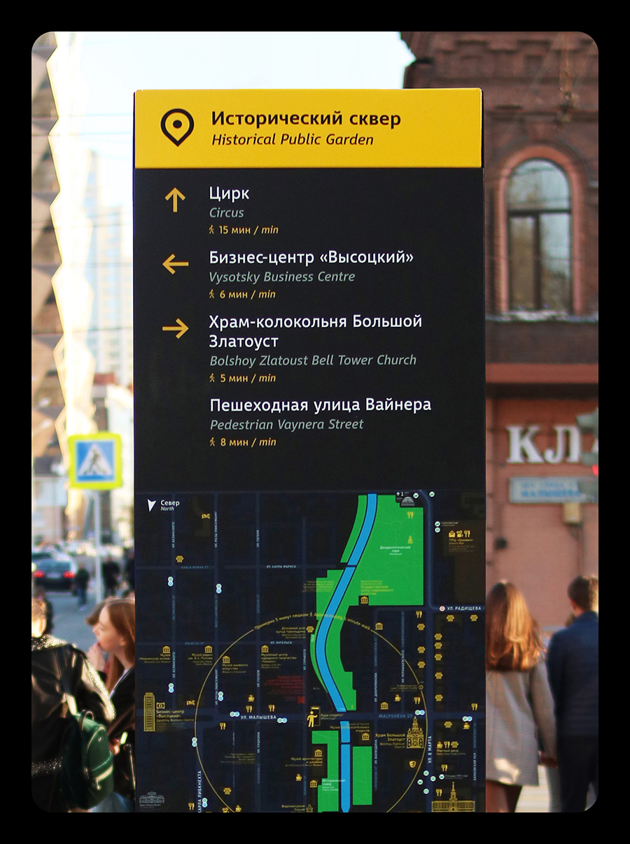
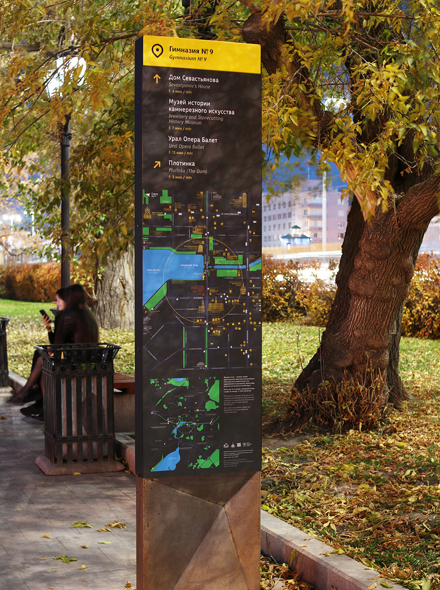
Interface and graphic design development for an urban navigation pylon, featuring a map layout and directional signs for the Historical Public Garden in Yekaterinburg
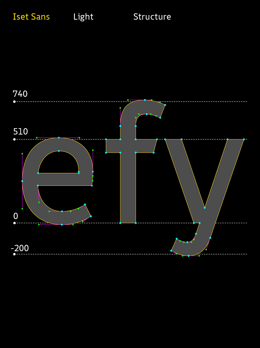
The design process of the Iset Sans typeface, showcasing vector outlines, anchor points, and font metrics for letters
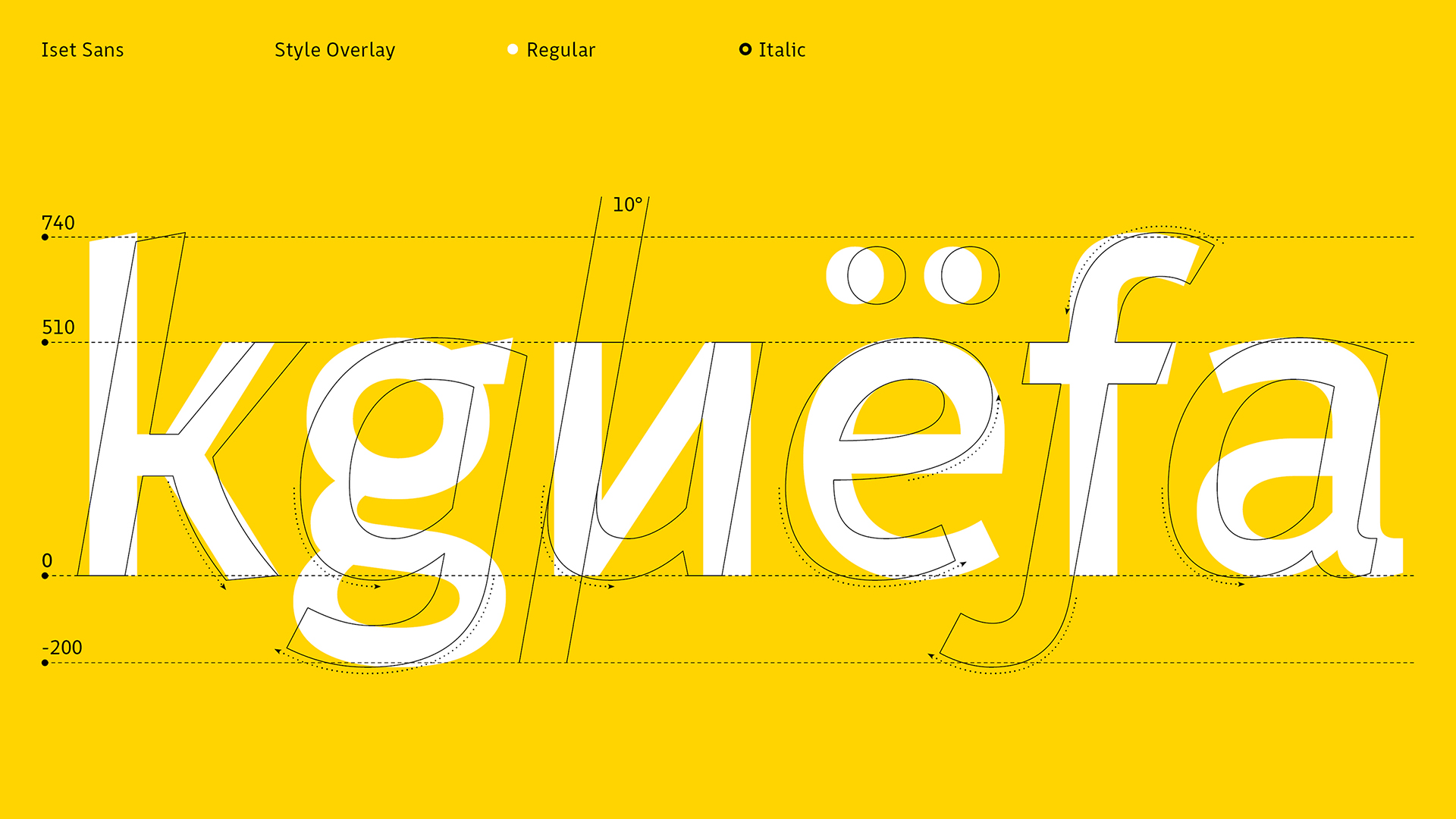
Style overlay diagram of Iset Sans Regular and Italic styles, demonstrating a 10-degree slant angle and structural glyph changes
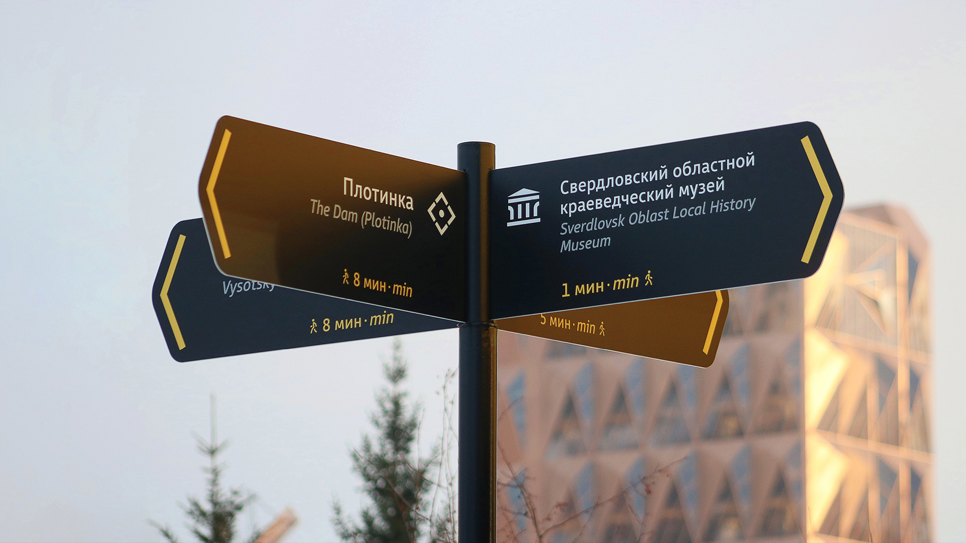
An implementation example of the pedestrian wayfinding system in Yekaterinburg: a street signpost directing to Plotinka and the Sverdlovsk Oblast Local History Museum against the RCC headquarters building
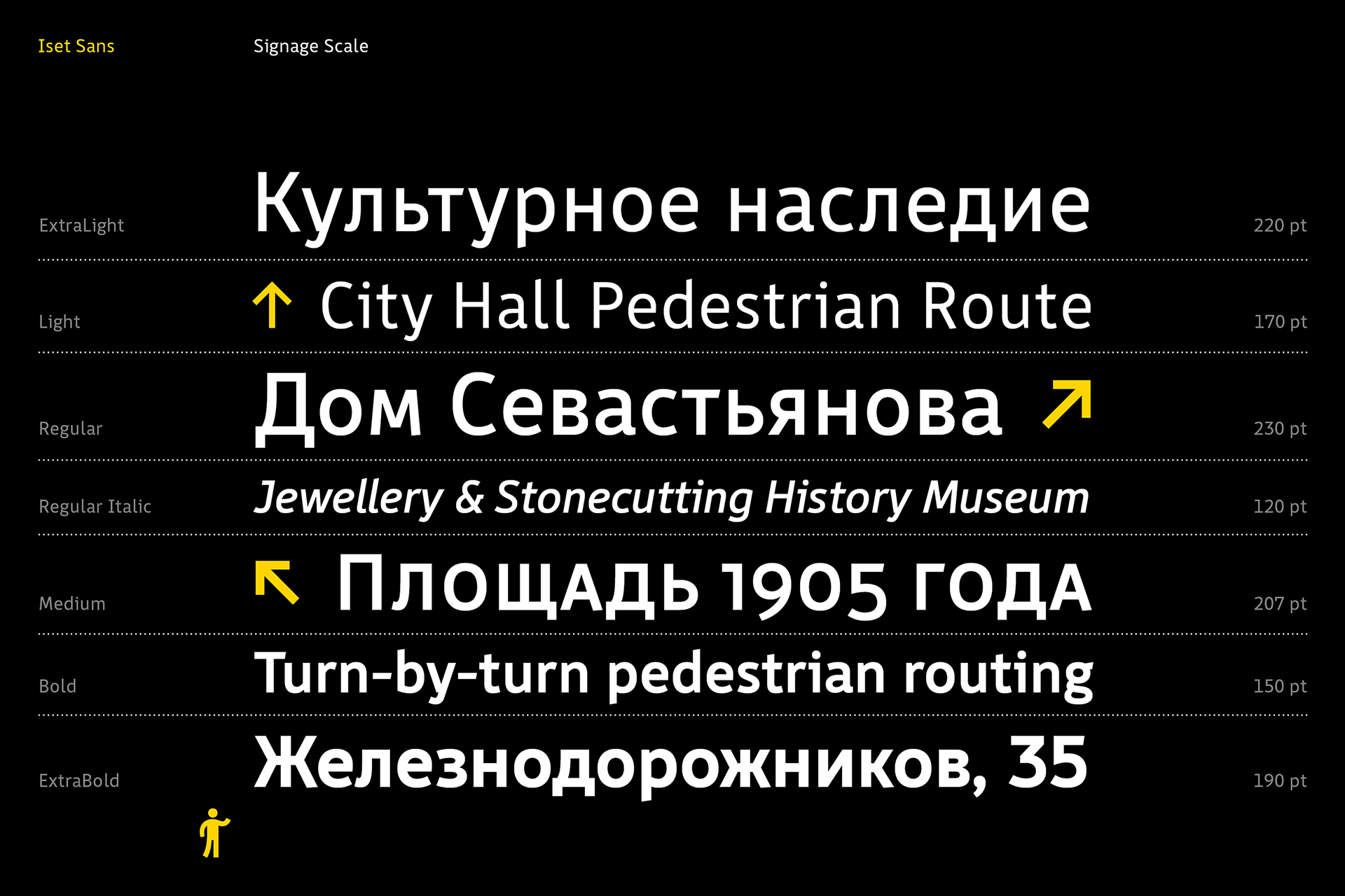
Signage scale presentation and typography weight system of the Iset Sans typeface, demonstrating styles from ExtraLight to ExtraBold using Yekaterinburg wayfinding design examples
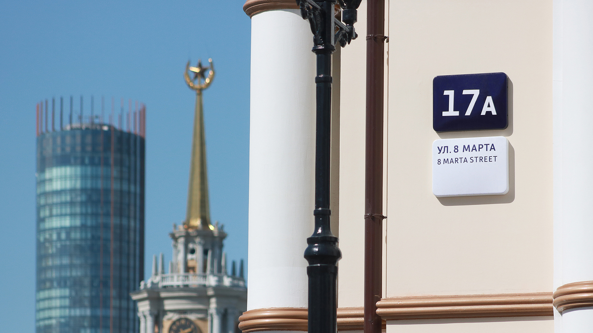
An implementation example of the designed building address plate
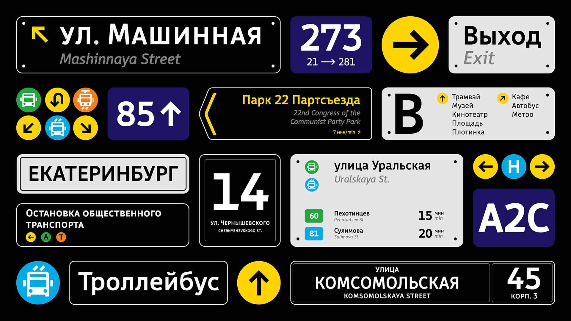
Comprehensive urban wayfinding design system for Yekaterinburg, showcasing mockups of street signs, house number plates, transport pictograms, and navigation elements on a dark background.
Typeface weights showcase of the Iset Sans font family (ExtraLight to ExtraBold) using Cyrillic and Latin text pangram examples
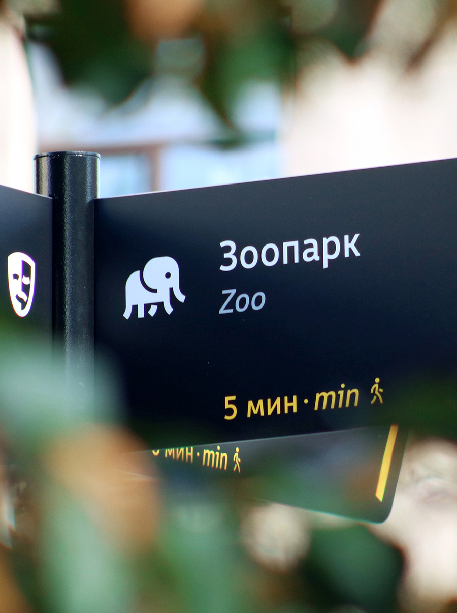
Close-up photo of a pedestrian navigation sign directing to the Zoo, showcasing custom elephant pictogram and estimated walking time in minutes
An implementation example of urban wayfinding in Yekaterinburg: an installed navigation pylon featuring a detailed map of the Historical Public Garden and directional signs
Typeface weights demonstration of the Iset Sans font family from ExtraLight to ExtraBold, showcasing Cyrillic and Latin pangrams
Geometry and proportion showcase of Iset Sans typeface, demonstrating special characters, glyph descenders, and x-height metrics on a coordinate grid